A UX Designer | Product Designer | Interaction Designer.

Citadel is the One-stop solution for digital production factories, delivering secure data transfers using cloud based application tailored for employees working in factories.
**Note: This case study is a recreation of my actual work, with substantial modifications to comply with NDA requirements and omit specific information, designs, and concepts related to the actual product and my contributions.
who are all Involved
A team of 2 designer ( UX designer, Visual Designer ) , Product Manager, 4 Front end Developers , 4 Back end developers , SME's ( Internal & External SME's).

2 Designer
(UX designer, Visual Designer)
1 Product Manager
8 Developers
SME's
( Internal & External )


Our Challenge
Our challenge was to Redesign the Citadel UX, making it minimal, intuitive, and seamless experience, while preserving its core functionality by filling the business Needs. We are not just designing a Solution we are actually changing the system by Redesigning the citadel web application.
Thinking as a UX designer, I led the end-to-end redesign of Citadel—by adopting to a Design thinking methodology.
It wasn’t just about UX/UI execution — it included strategic planning, stakeholder alignment, mentoring, and ensure the solutions is scalable and measurable in both user and businesses .”
Project Overview
Core Business Problem were solving
In digital manufacturing environments, sharing and transferring data is more important all the teams relied on manual methods transferring data USB drives, emails and drive to transfer critical production files between Factories to stations. Due to that users faces different problems such as data loss, Data Security, Malware Attacks, unclear audit trails, Version mismatches and delays the product lifecycle.

Business Objective
The business wants Citadel to be a centralized, secure, cloud-based platform that efficiently manages data transfer across digital product factories by streamlining file transfers, enforcing reliable version control,audit tracking and enabling seamless collaboration between internal manufacturing teams and external vendors.
Design Process


Research and Discovery Phase
Project Kickoff & Stakeholder Alignment
To set the foundation for Citadel’s, I facilitated a cross-functional kickoff workshop with stakeholders , PMs and subject matter experts. Our objective was to align on business goals, user challenges, and Technical Constrains that impact digital product factories. This involves gathering all Product information and user data to identifying user problems through multiple calls and sittings with stakeholders.
" Conducted Cross Functional Workshops "

Stakeholder Observations

stakeholder described their platform as
“Overloaded, Performance Issues, and repetitive.”
To avoid premature design solutions we reframed the given feedbacks as a working hypothesis. This ensured our focus remained on uncovering root causes through research-driven insights.
Phase 1 : Quantitative Research
We conducted quantitative research to uncover foundational patterns in our users’ demographics, roles, technical proficiency, and workflow behaviors within manufacturing environments.
Our goal was to validate user characteristics at scale and establish a strong baseline before diving deeper into qualitative studies.


Phase 2 : Qualitative Research
Conducted a Cross Functional Workshops by remote user interviews with Users in Citadel environment, including custom manufacturers, vendors, and production managers and SME's, to gather insights in their environment with their experiences, challenges, and expectations regarding citadel. These interactions helped in gaining insights for collecting user needs & pain points, and Feature expectations.

Users helped us understand the Personas their Workflows, user Needs & Pain Points

User Problems

Baseline Usability Testing with Users
We tested the existing Citadel experience to benchmark usability to identify citadel workflow frictions.
Participants
Product Managers
Custom Manufacturers
Vendors
Engineers
Area of Expertise
Station-level file sharing, Providing Access
Station-level file sharing, live operations
Station-level file sharing,External access, permission setup
Version tracking, file review, internal QA
Tasks Observed :
-
Upload a file and assign it to a station
-
Share with a vendor securely and adjust permissions
-
Confirm version history and view activity log
-
Access recently uploaded files
-
Approve a file for factory-wide use


Key Takeaways

Affinity Mapping

Define
Refined Problem Statement
Citadel’s current design creates significant cognitive overload for users due to its complex navigation, redundant steps, and unclear workflows. As a result, expert users face delays in critical tasks such as uploading, sharing, and verifying files leading to reduced trust, slower collaboration, and low system confidence in digital product factories.
Goals
The goal are set to:
-
Reduce cognitive load by simplifying the information hierarchy and task flows
-
Streamline navigation and eliminate unnecessary steps across workflows
-
Make the platform intuitive and minimalistic, without compromising its secure architecture
-
Increase transparency and confidence in file uploads, version control, and station assignments
-
Make users feel Secure and Safe across the Platform.
How did we plan to measure the success of these goals ?
-
Related Navigation Issues : We Reduced the Number of Clicks & Task completion Rate to complete a Task
-
Cognitive Load : We redesigned the form completion by 2x Speed by adding hover tooltips, skipping optional fields , providing Auto-suggestions.
"Let's Understand how we Measured Navigation Issues"
Before Citadel

-
Total Number of Clicks : 12 + Clicks
-
Total time Taken : 15 mins
-
Wait Time : 10 mins to 20 mins ( Getting Approvals & Permissions )
After Citadel
-
Total Number of Clicks : 6 Clicks
-
Total time Taken : 3 mins
-
Wait Time : 05 mins
" Let's Understand how we measured Cognitive Load "
-
During User Research, we asked vendor, to finish the File upload process for selected product to a specific station. We observed that our user navigating the an upload form, which included fields like:
-
DRI
-
Line Server
-
Operation Reference ID
-
-
What We Observed
-
Priya paused for 5–7 seconds at each unknown field.
-
She eventually skipped DRI and Line Server.
-

These terms required domain knowledge, which vendors didn't have.
" Well, I’ve seen this before, but no one ever explained what to put here. I just leave it blank "

-
We redesigned the form completion by 2x Speed.
-
Progressive Disclosure
-
Advanced Filtering
-
Adding tooltips
-
Skipping optional fields
-
Providing Auto-suggestions.
-
User Persona
We Captured 2 User Groups
-
Manufacturing team working in Production Units
-
Vendors who are from Different Stations
Nitty-Gritty Differences We observed

Through User Personas, We outlined the User Demographics such as Age Groups, Workflows, characteristics, goals, and pain points.
Each persona was further detailed to understand Users behaviour, emotions, through Empathy to better understand how users interact within system and make informed design decisions.
-
We captured the user’s roles, context, user goals & real-world needs.
-
Also a quick day-in-the-life snapshot to understand User Workflows and pain points.
-
we also include their tech familiarity, and device preferences to design seamless cross-platform experiences.
-
we focus on their mental models and decision-making patterns to ensures the interface feels intuitive with cognitive alignment.
-
we also consider accessibility needs, trust factors, and behavioral patterns to ensure the design feels inclusive and intuitive.
Custom Manufacturer Persona

Vendor Persona

Strategy and Concept
Conduct Card sorting to organise the content. This will uncover how users naturally group information. This helps align the product structure with user expectations, guiding IA and navigation design.


Define use cases to capture real-world user goals and scenarios, then map user flows to illustrate the step-by-step actions needed to accomplish those tasks. This ensures the design supports users’ needs with a clear, efficient, and intuitive journey.
Through Information Architecture (IA) we Structure content and features based on user behavior and priorities to create a clear, intuitive navigation system. A strong IA reduces cognitive load and makes information easy to find in real-world use.


Held ideation sessions and brainstorming workshops involving cross-functional teams, developers, and stakeholders to address these prioritized pain points.
Design low-fidelity wireframes to visualize key interactions and layouts early in the process. Present them to stakeholders to gather timely feedback, minimize rework, and align with business and technical goals.


Card%20sorting.jpg)
Use Cases

User Flows for Admin Case and Vendor Case


Solution Design
Low-Fedility Wireframes
Version 1

Feedbacks Received
Keep It Simple
Read Less | Scan More | Consistent Flow
Minimalistic Design
Simplified Layout | More Functionality
Citadel
Use of Existing Patterns
Visuals | Icons | Typos | White spacing
Simplified workflow
Intuitive interfaces | Creative
Deliverable Screens
Admin Screens
-
Home Page :
-
User Management Page :
-
History Page :
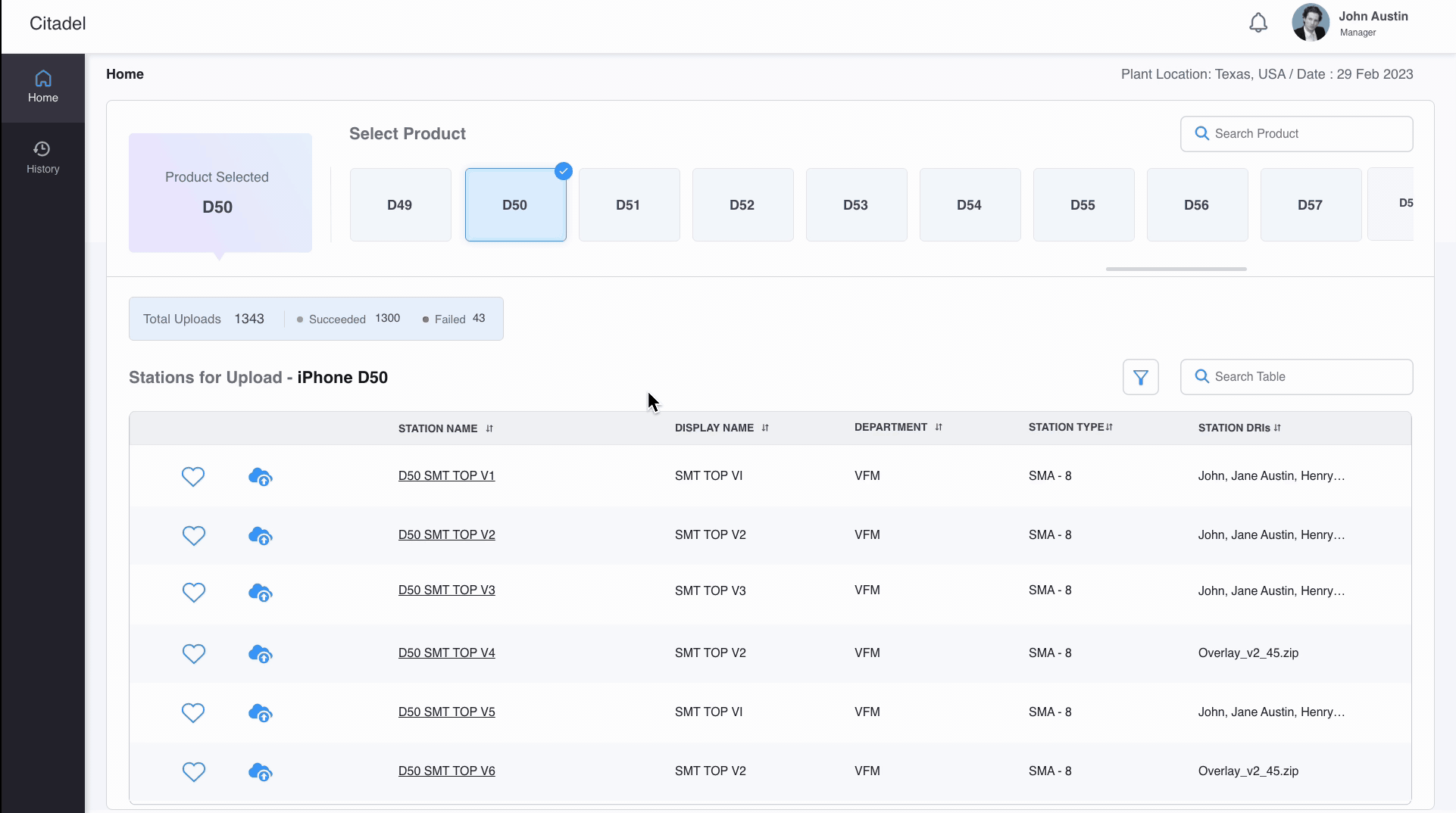
Product ListView | Station Listview | Station Page | Upload File Process
Vendor Listview | Vendor Profile View | Assign / Disable Station to vendor
Admin Activities | Upload File History | View all files
Vendor Screens
-
Home Page :
Product ListView | Station Listview | Station Page | Upload File Process
-
History Page :
Admin Activities | Upload File History | View all files
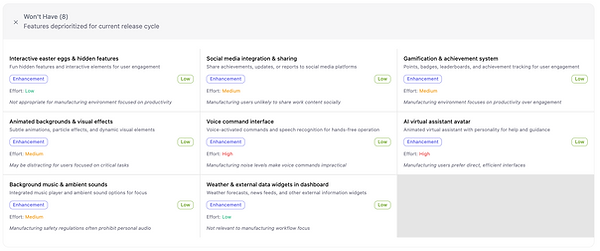
MoSCoW Feature Prioritization Matrix


Version 2

Style Guide


Design decisions
Allow vendors/admins to quickly choose the product line they are working on (e.g., D49, D50).
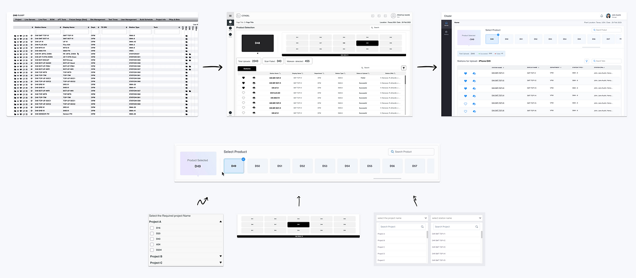
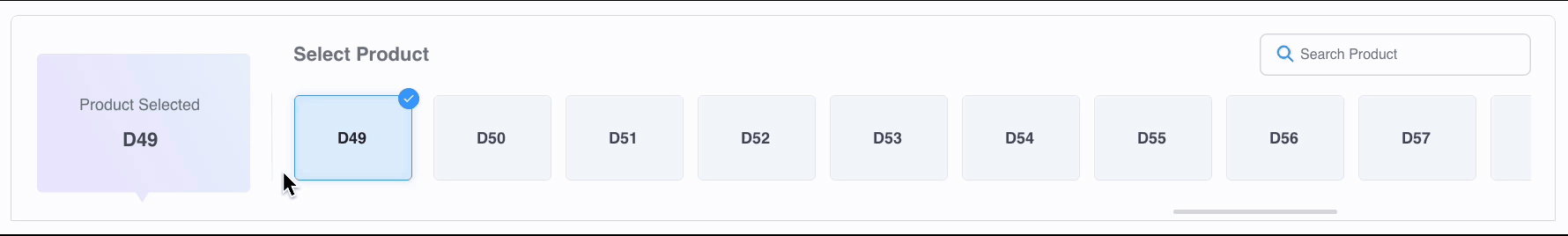
Why Product Cards Instead of Dropdowns
-
One-tap access via rails is faster than dropdown.
-
Product rails display all stations related to product, allowing users to see what's available without interaction.
-
In contrast, dropdowns require user effort to open and browse a cognitive and interaction step that can slow users down
Allow vendors/admins to quickly choose the Station and add to favourites that they are working
Vendors and admins often work with multiple stations and need to switch between them quickly. Searching or scrolling stations every time slows them down and increases friction. By allowing users to mark frequently used stations as favorites, we reduce navigation steps, speed up workflows, and minimize cognitive load — making the overall experience faster and more intuitive.
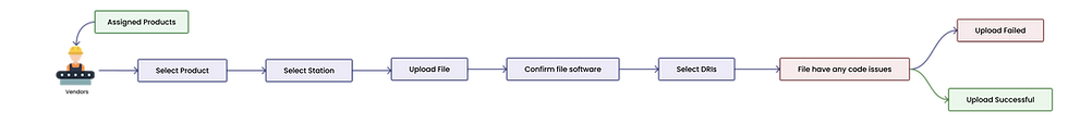
Allow Vendors/admins to quickly Upload file and add Meta data fields
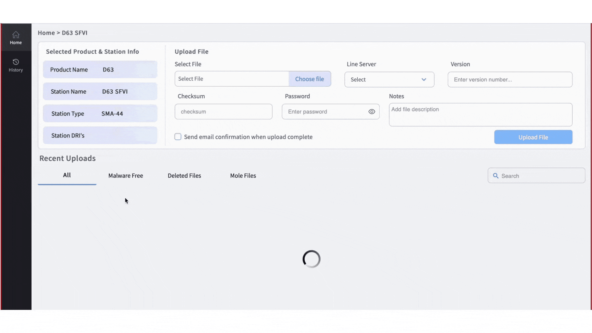
we split the file upload flow into 3 steps to reduce cognitive overload and progressive disclosures. By guiding users in step-by-step which reduced errors, and gave them clearer feedback along the way.
Final UI Screens

Conclusion Statement :
By reimagining Citadel’s user experience, we delivered a solution that not only met our core objectives but drove substantial, measurable improvements based on our Usability Report.

For more details Visit here:
https://www.notion.so/Citadel-User-Experience-Testing-Report-1ee8e24caa4f802ea6f9e39ee65702a8?pvs=4
Achievements
I am honored to receive the Spotlight Award in acknowledgment of my exceptional performance in successfully completing the project within the designated timeframe


