A UX Designer | Product Designer | Interaction Designer.
MBC+ ( Design System )
Leveraging my understanding of design to help teams simplify complex experiences and creating a Seamless Experiences Across Web, Mobile, and TV

Team
As a UI/UX Designer i worked with the team of 6 designers who are completely responsible for designing Design system.
Duration : 4 Months
Objective
During 2020's Tata Elxsi tied-up with Middle Eastern media and entertainment industry. we are asked to build a design system. During 2020s Entertainment platform is booming and growing so big. Where Middle Eastern media and entertainment industry is at USD 30.35 billion in 2020 and expected to grow at USD 47.03 billion by 2026.
Why such a Rapid Growth ?
Today’s viewers want to watch content on their own terms—whether it's on a TV, phone, or computer, and whenever or wherever they choose.
While home entertainment remains popular, people now expect a seamless, personalized experience across all devices.
To meet these evolving needs and keep audiences engaged, the industry requires a unified platform that delivers consistently across screens.
MBC+ Design System serves as the unified source of truth for delivering a seamless, high-quality experience across TV, web, and mobile platforms. It streamlines collaboration between designers and developers—enabling the rapid creation of engaging self-care interfaces—and is built for flexibility, so it can evolve with new features and updates without sacrificing consistency in the user journey.
My role
As Senior UX Designer, I am responsible for Redesign of MBC+ Design System for Version 3. Our strategic goal was to enhance design consistency and efficiency across the platform. We built one central library of reusable components for TV, phones, or computer so developers could easily create consistent, high-quality self-care features.
Key Responsibilities
-
Conduct Research, UI Design and Build Interaction throughout the application
-
Conduct interviews and surveys to uncover user needs and pain points
-
Apply design principles and accessibility standards which are aligned with business goals
-
Managing the design scope
-
Setting up a new design system for TV, phones, or computer applications
-
Closely working with the product team to define the road map, plan and execute the design.
-
Drive ideation workshops and design showcases
By creating a Centralised design system, we aimed to :
Speed up the design and
development process: with a ready - made library and patterns that teams can create and test layouts much faster.
Bring consistency in the visual style for products and application across devices (Mobile, Web, Tab and TV)
Improve brand perception and user trust through consistent experiences that work for everyone and allow users to accomplish their goals.
Promote accessibility of our products by building accessibility and inclusion into our component libraries, both from a design and code repository perspective.
Align MBC teams by giving them a more structured and guided way to build products.
The Process
This problem was addressed in three phases, outlined below.

Who are the Users?
Primary users will be the designers and developers who directly work on creating and implementing digital products and experiences.
Secondary users will be other team members who may not directly work on design or development but still benefit from the design system.

Beginning the design process
We formed a team of designers and engineers to establish a clear structure and guidelines for our components. Our main goal was to create a set of elements that could work together seamlessly within a larger system.
After researching different approaches, we decided that the Atomic Design methodology would be a strong foundation for our system.

Research
Benchmarking Study :
Prior to laying the foundation stone, we studied about existing design systems, how companies were building and organising them.
Browsed all around the web, including medium articles and guidelines. I referred to top-notch and elite design systems by Material Design, Carbon Design system, Meta, Apple ( HCI ) etc. I checked with other designers who faced similar challenges.
To better understand the different problems in our product, I conducted interviews with people from different departments (Front end developers, Product Managers, Engineering managers, Marketing manager…).
Accessibility :
From early on, We focused our efforts by putting accessibility as a pillar for our design system. Took into consideration the OS guidelines and made sure everything was on point (Native fonts / color contrast, touch target)
Mind Mapping
We used miro to list out and organized them into components used in our platforms into an initial structure of atoms, molecules, and organisms. So we started with atoms, the that will be the Foundation for our design system: Typography, Colors, Icons, Buttons, Form inputs, Labels and badges, links etc..,


General
Content Strategy
The best design systems are not simply engineering manuals or style guides – they need to illustrate the toolset and explain why one should use a component over another. We invested lot of time to build principles of our design system as well as developing guidelines for accessibility that were baked in from the start.

Visual Style
Color Palette and Gradients

Color Palette is to establish a cohesive design system we began by defining a primary and secondary color palette. To ensure optimal readability we manually checked contrast ratios using WebAIM's contrast checker. While numerical values are helpful, visual assessment played a crucial role in selecting the most suitable color combinations.
To ensure accessibility, we used a contrast checker to verify that our color choices met WCAG 2.0 AA standards. We prioritized color combinations that offered optimal readability, such as using white text on a darker background. To streamline our design process, we utilized available plugins. This plugin automatically generated HEX codes and standardized naming conventions for our color swatches, saving us time and effort.
Typography

We wanted to go with a clean and versatile font for the design system. We chose OpenSans LT Bukra because the geometric shape of the letters and the spacing between characters is perfect. It is a versatile font and has multiple variations in weight which allows it to act as both a header font and body font. We also factored the right to left orientation of Arabic script and layout.
Iconography

System icons are designed to be simple, modern, friendly, and sometimes quirky. Each icon is reduced to its minimal form, expressing essential characteristics. Icon shapes are bold and geometric. They have a symmetrical and consistent look, ensuring readability and clarity even at small sizes.
Components
Components are one of the key building blocks of the design system. Their systematic reuse helps to create
visual and functional consistency across products.
Each component has been designed and coded to solve a specic UI problem, such as presenting a list of
options, enabling submission of a form, providing feedback to the user, and so on. All of the components in
the design system have been designed to work harmoniously together, as parts of a greater whole.
Buttons

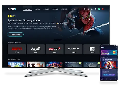
Cards & Rails

Hero Banner

Bottom Navigation

Challenges
-
Balancing consistency in designs
-
Managing version control
-
Testing and Iterating all the components to ensure that it continues to meet its objectives.
-
Keeping Up with the Industry Trends
-
Understanding User Interactions and their touch points
-
Cross functional collaboration between developers and designers.
